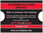
Hi Mike. I'm not a big fan of 'throwing rocks', but if it works on the other side of the river, I wish you the best. I did see a few typos on your proofs that I point out to be helpful:
First page, lichens' should be lichen.
Second page, 'alot' should be a lot. And 'combine' should be combination or something to that effect.
Will see ya at the round table in NOVA next month, right?
Count me in Ted!! And damn I looked for typos! Chit!
I guess I got to try throwing rocks once for myself. ya know? only gonna throw at houses with dirty roofs, better neighborhoods. And cross our fingers!
As far as this first atempt goes, at designing them did I do good? 5 bucks every image i used on first proof, so wasnt cheap! reorders are cheaper.
I knew we'd count on you being there bud.
Re your design, I'm sure there are others on here with a lot more expertise in that area than I have Mike. Hopefully someone with a marketing/graphics background will chime in.
To me, if they get your customers to call you, then they're great! Best of luck with your marketing campaign Mike.
looks good Mike, only critique, and it's definitely nitpicking, but when you center your text you can "center" the alignment or "justify" the alignment ... when you're doing more than a couple lines it's easier to read when it's justified because it's still centered in the space but is aligned on both sides (think newspaper or magazine column).
Noone has said the not so perfect job, lining up the pics? Honestly I seen it too, it was a lil repetitive, re croppin pic, and it still didnt fit just perfect! Fix them next time! lol! clicked approve!
Bought a small amount of them to test. Not throwing out 100 a day, just If I see a house, driving by, I want, throw a rock.
I'm gonna find other uses too for this POS. We have more than a biz card to pass out! yay!!!!!
Here is an Idea? Nobody doing this yet! Give 5 out to every happy customer. Decent size job, atleast a roof cleaning. Have a blank area where the customer can write their name address and phone #. Also a logo with "This postcard is worth XX% off any job over $XXX."
Happy customers like to brag what they just got, we aint cheap, some do it for free. Offer that customer a finders fee every time of his postcards shows up! They shouldnt be called post cards, Coupons right!
looks good Mike, only critique, and it's definitely nitpicking, but when you center your text you can "center" the alignment or "justify" the alignment ... when you're doing more than a couple lines it's easier to read when it's justified because it's still centered in the space but is aligned on both sides (think newspaper or magazine column).
I tried to center stuff, and it still didnt look right. Still honing my skills.
Used vista print, expensive but plenty of tools.
I think I understand what you are talking about, it sorta widens and shortens eack line to form verticle sides , like newspapers?
exactly ... titles (like our signatures on this forum) look good centered, but doing it that way looks better for paragraphs ... either way, they look nice, good luck!!!
Mike, on my computer the pics were small, but that was probably just on my computer. In 1 and a half hours I got 3 roofs throwing rocks. After that day it was bad. I was only getting one job for about 5 hours of throwing. Good luck Mike.
looks good Mike, only critique, and it's definitely nitpicking, but when you center your text you can "center" the alignment or "justify" the alignment ... when you're doing more than a couple lines it's easier to read when it's justified because it's still centered in the space but is aligned on both sides (think newspaper or magazine column).
I tried to center stuff, and it still didnt look right. Still honing my skills.
Used vista print, expensive but plenty of tools.
I think I understand what you are talking about, it sorta widens and shortens eack line to form verticle sides , like newspapers?
Mike you can also try 123print.com its a little differant then vistaprint
Mike, on my computer the pics were small, but that was probably just on my computer. In 1 and a half hours I got 3 roofs throwing rocks. After that day it was bad. I was only getting one job for about 5 hours of throwing. Good luck Mike.
how many did you throw out in 5 hrs? I would track it by how many you throw. Our track rate is 2 calls per 300 flyers. Sometimes more sometimes less but that is the average.
you really need to track where you throw and how many you throw. Just like you should track all your marketing to see what is working and what is not, it will only help you in the long by not wasting money on things that just don't work.